
ATMOS. Violet horizon above white void.
- Studio
- Light theme
- 3 colors
- 3 typefaces
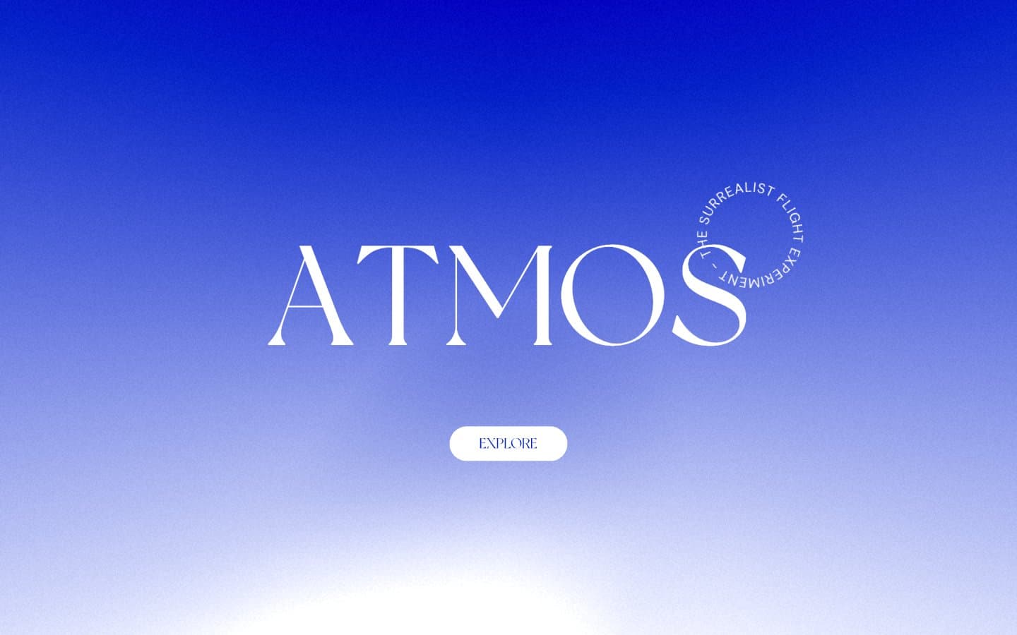
Atmos is a single-screen meditation: one deep violet sky fading to lavender above an expanse of white silence. The entire interface lives in the first viewport — a colossal serif wordmark, a ring of small caps text orbiting it, and a single pill button — then dissolves into negative space. Typography does the heavy lifting: a custom display serif at 200px whispers rather than shouts, paired with DM Sans for micro-labels. There is no product UI, no navigation bar, no cards, no shadows. The only chromatic note is the violet gradient; everything else is paper-white and ink-black.
ATMOS design system

Brand1
Hero gradient anchor, decorative atmosphere — the singular chromatic note; fills the sky of the opening viewport
Neutrals2
Body text, headings, button text, border outlines — the only contrast color
Hairline borders, dividers, input outlines, and card edges on light surfaces. Do not promote it to the primary CTA color
Try a pairing
Pick any two colors from the palette to check whether text stays readable on top.
Aa
Paper White on Ink Black
21.00 : 1 contrast
- Body textPasses AA 4.5
- Large textPasses AA 3
- StrictPasses AAA 7
More DESIGN.md files. Same web, different personalities.

Rauno Freiberg
Studio
Emil Kowalski
Studio

14islands
Studio
19–86
Studio
Aaron Poe & Co
Studio
Acceptandproceed
Studio
ACCOMPANY
Studio
Acolorbright
Studio
Adcker
Studio
Adopt
Studio
Agence Foudre
Studio


