
Atelier Deux-Cé. Sunlit editorial gallery.
- Studio
- Light theme
- 9 colors
- 2 typefaces
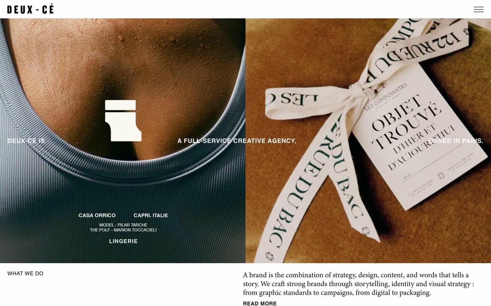
Atelier Deux-Cé presents itself as a sunlit editorial gallery — a Paris-based creative agency whose site reads like a curated magazine spread rather than a software product. The system is photography-first: full-bleed images dominate every screen, with type acting as quiet captions and labels rather than interface chrome. A palette of warm, sun-bleached earth tones (cream, linen, sage, taupe, olive stone) replaces the typical white/gray SaaS canvas, giving every page the warmth of a Provençal villa. Black type sits at near-maximum contrast against these warm surfaces, and a single saturated green is reserved for the footer like a garden border at the end of a path. Components are deliberately few and weightless — no shadows, no gradients, no borders thicker than hairlines, no rounded corners fighting the editorial print sensibility.
Atelier Deux-Cé design system

Brand1
Footer background only — the single chromatic accent in the system, used as a deliberate closing beat rather than a brand color spread across the UI
Neutrals8
Body text, headings, nav links, hairline borders, and link underlines — the single type color across the entire system
Muted section background, used sparingly as a quieter alternative to Olive Stone
Light warm-gray section background, the coolest of the earth-tone neutrals
Saturated warm section background — the deepest neutral step before any chromatic color enters
Deeper warm section background, used when a panel needs to recede from Pale Sage
Tinted section panels, the dominant non-white canvas tone
Soft section background, the first step off pure white — gives a page the warmth of unbleached paper
Page background, card surfaces, reverse text on dark photographic regions
Try a pairing
Pick any two colors from the palette to check whether text stays readable on top.
Aa
Ink Black on Garden Green
5.52 : 1 contrast
- Body textPasses AA 4.5
- Large textPasses AA 3
- StrictFails AAA 7
More DESIGN.md files. Same web, different personalities.

Rauno Freiberg
Studio
Emil Kowalski
Studio

14islands
Studio
19–86
Studio
Aaron Poe & Co
Studio
Acceptandproceed
Studio
ACCOMPANY
Studio
Acolorbright
Studio
Adcker
Studio
Adopt
Studio
Agence Foudre
Studio


