
ARTWORLD. Fashion masthead on white linen.
- Studio
- Light theme
- 2 colors
- 4 typefaces
ARTWORLD is a typographic art piece masquerading as a website — an agency masthead where the entire visual system is built from two weights of contrast: pure white paper and pure black ink. The aesthetic borrows from high-fashion editorial credits pages, where the talent roster becomes the design itself, and a single oversized wordmark anchors the composition like a magazine cover. Two type families do all the work: Cardinal Fruit (a refined display serif) provides the elegant italic voices for names, while Graphik Light at weight 300 supplies the quiet, whisper-thin supporting text — a deliberate anti-convention choice that makes the 75px display serifs feel monumental by contrast. Everything is left-aligned in a ragged editorial grid, with no color, no shadows, no rounded corners, no decoration. The system is monochrome to its bones and treats typography as the only meaningful design surface.
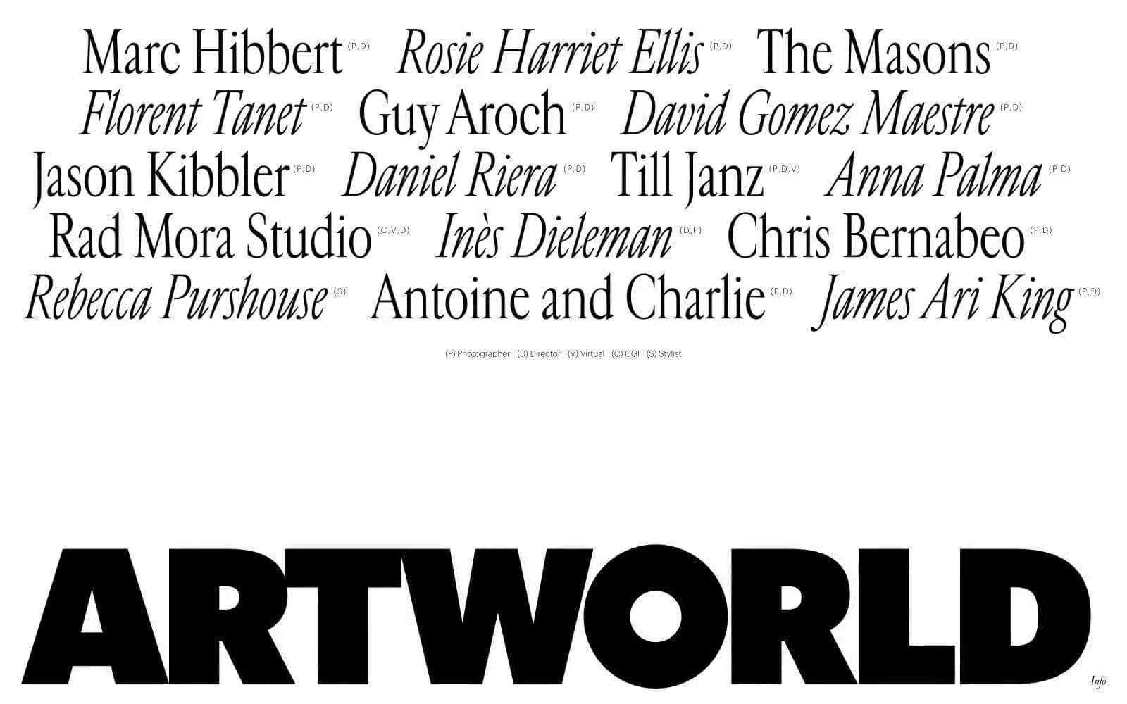
ARTWORLD design system

Neutrals2
All text, the ARTWORLD wordmark, hairline structural borders, link strokes — the only mark-making color in the entire system
Page canvas, negative space between type, reverse text on the wordmark bar
Try a pairing
Pick any two colors from the palette to check whether text stays readable on top.
Aa
Paper White on Ink Black
21.00 : 1 contrast
- Body textPasses AA 4.5
- Large textPasses AA 3
- StrictPasses AAA 7
More DESIGN.md files. Same web, different personalities.

Rauno Freiberg
Studio
Emil Kowalski
Studio

14islands
Studio
19–86
Studio
Aaron Poe & Co
Studio
Acceptandproceed
Studio
ACCOMPANY
Studio
Acolorbright
Studio
Adcker
Studio
Adopt
Studio
Agence Foudre
Studio


