
Artandcommerce. Art book spread on bone paper.
- Studio
- Light theme
- 3 colors
- 2 typefaces
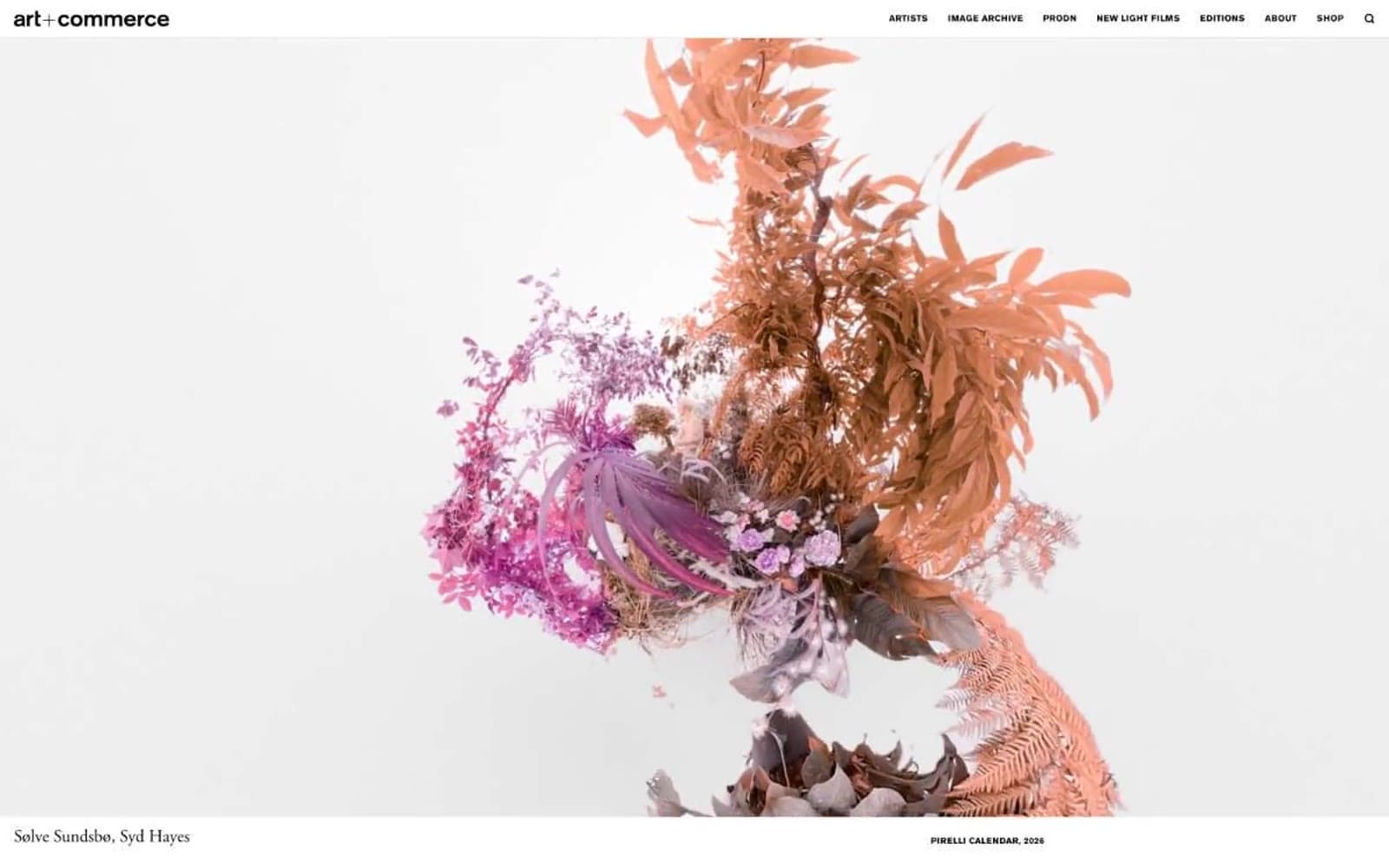
Art+Commerce is a quiet editorial gallery on bone paper: a near-monochrome canvas where large-format commissioned photography and magazine covers become the entire visual system. The type pairing is the signature — Adobe Garamond in weight 400 whispers editorial luxury while Akzidenz Grotesk in small, widely-tracked uppercase provides mechanical, gallery-label clarity. There is no brand color, no gradient, no shadow, no radius; hierarchy is built from a single black ink, generous white space, and a disciplined 56px display line. Density is sparse and the page breathes like an art book spread — images sit full-bleed, metadata hovers in tiny tracked caps at the edges, and every UI element defers to the artwork.
Artandcommerce design system

Neutrals3
Primary text, navigation labels, logo, link borders, footer type — the single graphic ink of the system. Every stroke, border, and character mark across the site
Secondary text and deep surface tone where slightly softer black is needed against bone
Page canvas, card surface, elevated surface — the warm near-white that holds all imagery and text
Try a pairing
Pick any two colors from the palette to check whether text stays readable on top.
Aa
Bone on Ink
16.98 : 1 contrast
- Body textPasses AA 4.5
- Large textPasses AA 3
- StrictPasses AAA 7
More DESIGN.md files. Same web, different personalities.

Rauno Freiberg
Studio
Emil Kowalski
Studio

14islands
Studio
19–86
Studio
Aaron Poe & Co
Studio
Acceptandproceed
Studio
ACCOMPANY
Studio
Acolorbright
Studio
Adcker
Studio
Adopt
Studio
Agence Foudre
Studio


