
Art In DUMBO. Gallery broadside on raw paper.
- Studio
- Light theme
- 9 colors
- 2 typefaces
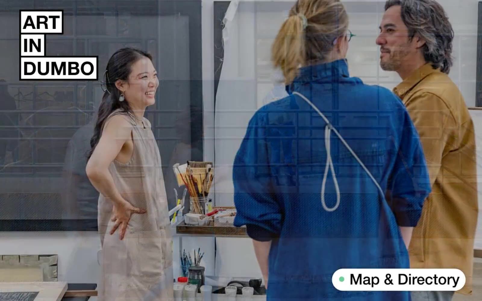
Art In DUMBO reads like a broadside poster pinned to a white-cube gallery wall: one weight of Helvetica at every size, black ink on raw paper, and a single sage-green accent that punctuates action and status like a curator's sticker. The system is unapologetically editorial — full-bleed documentary photography carries the atmosphere while the type system stays calm, dense, and confident at every breakpoint. Surfaces are almost entirely white or warm off-white; structure comes from hairline black rules, never from shadows or colored panels. Components are few and stocky: pill buttons with 50px radii sit next to sharp 2px-radius inputs, creating deliberate radius contrast. Color is rationed — sage green for the only real CTA, warm orange for urgency tags, and otherwise a pure black-to-warm-gray ramp.
Art In DUMBO design system

Brand1
Green action color for filled buttons, selected navigation states, and focused conversion moments
Accent1
Orange outline accent for tags, dividers, and focused UI edges. Use as a supporting accent, not as a status color
Neutrals7
Primary text, logo cells, hairline dividers between list rows, icon strokes — the only ink in the system
Button borders and label text for secondary controls
Shadow base tone for the single ambient drop-shadow pattern
Medium-contrast borders, control outlines, and structural separators
Warm off-white section backgrounds, large quiet surfaces that break the white without going gray
Input fields, secondary surfaces, subtle button hovers
Page canvas, card surfaces, pill-button fills, inverse text on dark cells
Try a pairing
Pick any two colors from the palette to check whether text stays readable on top.
Aa
Carbon on Sage
10.79 : 1 contrast
- Body textPasses AA 4.5
- Large textPasses AA 3
- StrictPasses AAA 7
More DESIGN.md files. Same web, different personalities.

Rauno Freiberg
Studio
Emil Kowalski
Studio

14islands
Studio
19–86
Studio
Aaron Poe & Co
Studio
Acceptandproceed
Studio
ACCOMPANY
Studio
Acolorbright
Studio
Adcker
Studio
Adopt
Studio
Agence Foudre
Studio


