
Anuc Home. A quiet, magazine-like space where oversized serif headlines and monumental rounded geometric letterforms frame intimate interior photography.
- Studio
- Light theme
- 10 colors
- 2 typefaces
Anuc Home is an editorial interior-design gallery: a near-monochrome warm-white canvas where oversized Instrument Serif headlines converse with quiet Instrument Sans UI, creating a magazine-meets-architectural-portfolio atmosphere. The signature move is the massive ANUC wordmark built from pure geometric shapes — full-radius arches and circles — that doubles as the brand's visual identity and its spatial language. The palette is deliberately restrained to 2% chromatic, letting photography of styled interiors carry all the warmth; the UI never competes, just frames. Components feel architectural rather than app-like: sharp corners, hairline borders, generous negative space, and no shadows. Density is compact in data sections but breathing in editorial sections, with 96px+ section gaps creating a gallery-walk rhythm.
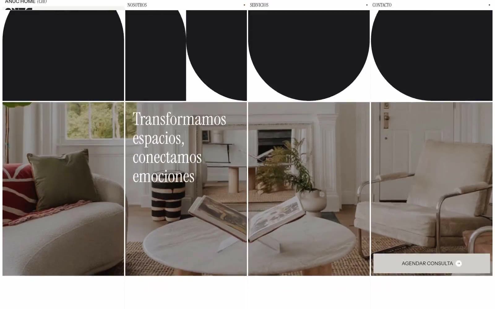
Anuc Home design system

Accent2
Sparingly used warm accent — appears as small punctuation dots or category indicators, never as fills; adds a whisper of warmth to the achromatic system
Secondary accent — cool counterpoint to Bronze, used in equally restrained dot/tag contexts to create subtle color rhythm
Neutrals8
Primary text, all borders, logo forms, icon strokes — the structural near-black that defines every contour across the system
Muted body text, secondary copy — warm dark gray for hierarchy below Ink
Tertiary text, timestamps, metadata — the lightest readable gray
Secondary borders, muted fills, icon strokes at lower emphasis
Hairline borders, divider lines, subtle structural rules — the thinnest visible grid
Muted surface for category tags, soft chips, low-emphasis backgrounds — warm-tinted neutral that steps between Paper and Canvas
Page background — warm off-white that gives the entire system its gallery-wall warmth rather than clinical white
Card surfaces, article blocks, elevated panels — pure white sits on top of Canvas to create subtle layering without shadows
Try a pairing
Pick any two colors from the palette to check whether text stays readable on top.
Aa
Paper on Bronze
4.78 : 1 contrast
- Body textPasses AA 4.5
- Large textPasses AA 3
- StrictFails AAA 7
More DESIGN.md files. Same web, different personalities.

Rauno Freiberg
Studio
Emil Kowalski
Studio

14islands
Studio
19–86
Studio
Aaron Poe & Co
Studio
Acceptandproceed
Studio
ACCOMPANY
Studio
Acolorbright
Studio
Adcker
Studio
Adopt
Studio
Agence Foudre
Studio


