
alet. Vintage editorial contact sheet on warm taupe paper.
- Studio
- Light theme
- 6 colors
- 2 typefaces
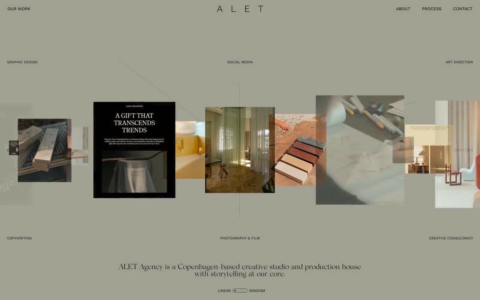
ALET Agency operates as a print-magazine spread translated to the web: a warm taupe canvas (#ada59b) swallows the entire page, typography stays whisper-small (11–13px WorkSans for all UI), and the ALET wordmark itself is set in a light serif with extreme letter-spacing that reads more like a magazine masthead than a logo. The entire color palette is strictly achromatic warm grays — there is no accent color, no CTA button fill, no state color. All visual interest comes from the photograph grid: an asymmetric, scattered arrangement of editorial imagery with floating category labels (GRAPHIC DESIGN, SOCIAL MEDIA, ART DIRECTION, etc.) positioned around it like captions on a contact sheet. Components are nearly invisible — no cards, no shadows, no fills, no rounded containers. The interface dissolves into the paper, and the work is the only thing the eye lands on.
alet design system

Neutrals6
Primary text, all borders, all hairlines, all SVG strokes. Used at full opacity — no softened text grays, no 80% black. The crispness against warm taupe creates the magazine-printed feel
Fine SVG illustration stroke — near-identical to Ink Black but kept distinct in the source. Use for line-art icons and decorative vector marks
Secondary text and supporting borders where Charcoal reads too soft but pure Ink is too loud. The single mid-step between nav and body
Navigation text and the nav underline borders. Slightly softer than pure ink for the persistent top-of-page chrome so the nav recedes behind the work
Occasional inset surface for body-level containers — the only tonal step above the canvas, used sparingly for any small frame or block that needs to separate from the page without introducing color
Full-page canvas, the single dominant surface — every section and component sits on this warm gray, never on white or near-black. The warm undertone (vs cool slate) is what makes the whole site feel like printed stock rather than a digital UI
Try a pairing
Pick any two colors from the palette to check whether text stays readable on top.
Aa
Taupe Paper on Ink Black
8.63 : 1 contrast
- Body textPasses AA 4.5
- Large textPasses AA 3
- StrictPasses AAA 7
More DESIGN.md files. Same web, different personalities.

Rauno Freiberg
Studio
Emil Kowalski
Studio

14islands
Studio
19–86
Studio
Aaron Poe & Co
Studio
Acceptandproceed
Studio
ACCOMPANY
Studio
Acolorbright
Studio
Adcker
Studio
Adopt
Studio
Agence Foudre
Studio


